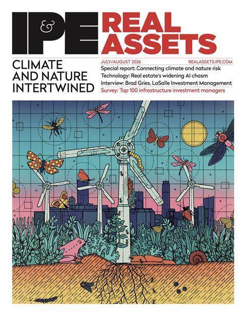
REGIONAL MARKETS: AMERICAS The Tour De France offers a useful analogy for understanding the ups and downs of US real estate, say Martha Peyton and Edward Pierzak

Last year marked the 100th anniversary of the Tour de France. With a little imagination, the race can provide some interesting analogies for real estate investors. The race starts on 29 June and is spread over 23 days, with 21 stages covering 3,404 kilometres. The course offers sections varying between flat, hilly, and mountainous terrain. Each stage of the race has the potential for a different winner, but the race is won by the rider with the lowest aggregate time. Winning requires riders to strategically address each stage of the race, tackling its unique challenges while focusing on the ultimate finish line. It is consistent good performance across the sum of the stages that matters for winning the race.

Real estate investors also tend to focus on long-term objectives with investment horizons typically spanning several years. Just like the ups and downs of the Tour de France course, real estate markets are characterised by segments or ‘cycles’, containing periods of expansion and contraction, as well as peaks and troughs. Over the segments or phases of the real estate cycle, property-type sectors and their different geographic markets will accomplish different patterns of outperformance and underperformance. As in the Tour de France, caution should be used to interpret the implications of short-run ‘winners’ and ‘losers’. What matters is investment performance over the long term, which is analogous to the end of the race.

Charting the course

Figure 1 shows US commercial real estate investment performance history as measured by the NCREIF Property index (NPI), the asset class’s most used metric. The figure shows a long-wave cycle pattern of accelerating and decelerating total return performance, with only two periods of negative total returns since the inception of record keeping in 1978. At the time of writing, the current cycle has been producing solid positive total return since early 2010 when the last cycle bottomed. Compared with the historical cycle pattern, the current expansion is still young, but it is maturing as quarter-by-quarter total returns have been decelerating.

Investment performance has varied widely across geographic markets since the recovery began in 2010. The differences in market performance are clearly evident in transactions data reported in the Moody’s/RCA Commercial Property Price index, which shows that the top six metro areas have enjoyed most of the benefit, with their prices recovering 79% of their peak-to-trough losses as of March 2013.

Other locales have lagged, recovering only 32% of their losses. Within the six major markets, apartment and office properties are now above their prior peak prices. The strength of recovery in major markets is clearly embedded in their lower-cap rates. The attractiveness of the major markets is not hard to comprehend. Among the big six are the largest and most liquid real estate markets in the US. Two of the six have single-digit office vacancy rates, putting them among the tightest markets in the country; three of the six constituted the top-three strongest-performing office markets during the last full cycle.

With recovery largely accomplished in the six major markets, the force of the cycle is beginning to shift. This is shown in the decline in cap rates and increase in the number of properties traded in the office secondary market during the first quarter versus the year before. In contrast, fewer office properties changed hands in the primary markets, easing the downward pressure on cap rates, which were essentially unchanged.

So, investors could say the primary markets won the first phase of the race to produce performance following the cycle bottom, but that secondary markets are poised to win the second phase. Moreover, some might even say that it is an opportune time to shift their investment bets to the secondary markets. But Tour de France veterans would discourage such behaviour and remind investors that it is the long-term finish line that really matters.

Conflicting signals In the Tour de France participants often possess a special ability. Some riders may be excellent ‘sprinters’, others outstanding ‘climbers’. These two types of riders are adept at different portions of the course. Given different physical demands, it is unlikely that one rider is exceptional at both of these disciplines. In fact, the race recognises these specialities, awarding the ‘King of the Mountains’ with the red polka dot jersey; sprinters tend to vie for the green jersey, which is awarded to the points classification leader/winner.

Similar to the bike race, property markets tend to have different performance characteristics over distinct phases of the cycle. As a result, time periods matter when measuring performance. Unlike the Tour de France, one of the challenges with real estate investing is to identify accurately the beginning and end of the race; there are no clear start and finish lines.

It is every investor’s hope to buy at the trough and sell at the peak; it is every investor’s nightmare to buy at the peak and be forced to sell at the trough. Some investors have the luxury of flexible time horizons, others are more constrained; all need to define their horizon and understand its relationship to the cycle.

To illustrate the difficulties with identifying start and finish lines, figure 2 shows the top-performing markets over different time periods using two data sources. NPI data includes the apartment, hotel, industrial, office, and retail property types. The PREA/IPD US Property Fund index includes these five sectors, as well as self-storage, land, and an ‘other’ category that may include – but not be limited to – entertainment, parking, and senior housing properties (we include the latter index because it has recently been introduced and will become more and more visible over time). Examined periods include the last five years (Q1 2008 to 2012 Q4), the last full cycle (2003 Q2 to 2010 Q1) and long-term history (1985 Q1 to 2012 Q4).

Gauging individual property market performance over different time intervals and data sources reveals very different results. Due to data limitations, PREA/IPD and NPI data are both available only for the period 2008 Q1 to 2012 Q4. The two data sources show that none of the top-performing markets during this period were among the six primary markets, and that Houston only appears as a top performer for both data sources. The differences between the two lists probably reflect the disparate composition of properties in each index. Clearly, data sources matter when measuring performance. Different time periods also matter, as shown in the rosters of ‘winning’ markets, according to NPI data over the three time periods. Only Washington DC and San Diego are among top performers for two of the three time periods.

Of the two, Washington DC is among the six primary markets. The bottom line here is that these backward-looking total return results offer no clear conclusions regarding markets or time periods. Another potential trap associated with singleminded focus on backward-looking total return is its inability to see the challenges ahead. This is well demonstrated by examining supply deliveries estimated by CBRE Econometric Advisors. Figure 3 ranks the top markets in each property type by expected cumulative completions over the next five years as a percentage of total current stock. These estimates are based on construction in each market’s pipeline from projects now underway through those in the early phases of planning. For the latter part of the five-year period, the estimates are modelled using past construction history for the market. With few exceptions, the largest supply responses are expected in secondary markets.

Yet, these results are not necessarily surprising, as many of these markets have historically had disproportionate supply responses that tend to err on the side of excess. Even though secondary market performance appears to be strengthening now, they are unlikely to finish as winners if demand is unable to keep up with supply.

Another challenge pertains to market liquidity. Real Capital Analytics shows that in the last downturn (2008 and 2009), total US transaction volume was roughly $190bn (€138.6bn). The six primary US markets accounted for slightly less than one-third of the volume; the 16 highest volume secondary markets accounted for a similar amount. The remainder was spread across more than 100 markets. While liquidity tends to dry up across all markets in ‘bad times’, the problem can be particularly acute in secondary markets, which are already shallow. Potential constraints on exit strategies may temper the investment appeal of at least some secondary markets.

Strategy for winning the race

The changing leader boards associated with different data sources and different measurement periods suggest that care should be taken before extrapolating any of these results. Ignoring forward-looking metrics and the nuances of liquidity also appears ill-advised. Winning strategies need to consider all these factors.

Our approach attempts to do so in three analytic steps. Firstly, time horizon is standardised by focusing on the overall investment performance cycle. Secondly, analysis extends beyond total return history to include ongoing evaluation of property market fundamentals and their drivers. Thirdly, market depth and liquidity are measured and tracked as they evolve through the cycle. The strategy that emerges from this process tends to target metropolitan areas that are supply-disciplined, major markets with solid long-term economic growth prospects and ample real estate stock and transaction activity.

Target markets include primary and secondary markets, which mitigate potential adverse impacts from a transition of top performance from primary to secondary as is now underway. Our recent examination of the historical performance of target-market portfolios revealed that, though they have not outperformed in every period time, they have outperformed consistently over past full real estate cycles. In contrast, non-target portfolios underperformed persistently over full cycles.

Figure 4 shows the evolution of the cycle, showing the total return spread versus sector specific indices for target markets. The charts cover 1985 to 2012, illustrating that the relative performance of target versus non-target markets has not been uniform over time, but that target markets have outperformed over the long term.

Most recently, target market portfolios for all property types, except apartments, have solidly outperformed non-target portfolios, but the total return spreads between the portfolios have narrowed over the past year or two. Since 2010, the apartment target and non-target market portfolios have performed generally in line with one another until 2012, when the non-target market portfolio outperformed. These overall results are not surprising as the spread compression reflects the natural maturation of the real estate cycle.

In essence, secondary markets are catching up with primary market counterparts. The reversal in apartment performance and significant narrowing of the office total return differentials coincide with major market property prices for apartments and CBD office exceeding their past prior peaks. The apartment and office experiences suggest that these sectors are further along in their real estate cycles than the other property types. In the next phase of the cycle, the concentration of supply deliveries in non-target markets will introduce further repositioning in relative performances.

Staying the course

Today, real estate investment sentiment appears to be shifting. Primary markets are falling out of vogue while secondary markets are garnering favour. While recent data appears to support this change, care should be taken before extrapolating these results and crafting investment decisions based upon them.

Why? As shown, there are different measures of investment performance that produce different lists of top-performing markets for the same time period. Additionally, the identities of top-performing markets change over time, even using one consistent data source. These discrepancies suggest that backward-looking total return performance is inadequate as the single basis for selecting markets.

The above offers a broader approach to market selection that incorporates, firstly, a standardised time period focusing on full cycles and long-term horizons; secondly, analysis of an array of data in addition to total return, including current and expected market supply and demand; and thirdly, analysis of market depth and liquidity as well.

This approach produces a target set that includes a mix of primary and secondary markets. Using total return history back to 1985, we show that target markets selected in this fashion have outperformed with persistence.

Even though secondary market performance appears to be strengthening now, we believe that this will be short term in nature. The true winners will probably be limited to those markets that enjoy disciplined supply, healthy demand, and deep liquidity. Markets that lack these attributes have not offered initial yield premiums large enough to compensate for disproportionate supply responses, anaemic demand, or shallow liquidity.

As a result, a wholesale move into secondary markets at this time would probably be ill-advised for long-term investors. In the Tour de France, it would be akin to solely focusing on a stage in the race, rather than the ultimate finish line for the race as a whole.

This is an abridged version of a white paper produced by TIAA-CREF.

Martha Peyton and Edward Pierzak are managing directors of global real estate strategy and research at TIAA-CREF